Showing posts with label ARH4724. Show all posts

Monday, November 30, 2015

Design for Good

Checkpoints for the Elderly - KinCare

Creating a small group of diverse people who are assigned an elderly person so the burden isn’t put only on one person. The group is based on volunteer, each person is involved in the same situation and can help each others dependents. There is a map app involved where you are able to help based on your own personal schedules and location. There is in increasing population of elderly with the aging Baby Boomers and there will be a large demand for care, health care, and emotional wellbeing.

Group chat and app

App with health monitor – person can be aware of elderly person’s vitals

Like an Uber for health

Possible Sponsors:
Elderly Healthcare products:
Firefly Cellphones:
Private Bus or Shuttle Services
Pharmaceutical Companies
Hospitals
Lawyers (Wills Attorneys)


Addressing an Issue

Topic: Do people really know what they're putting into their bodies when they drink soda? And are they aware of what it does to them?

Example of awareness through posters:

<-(prototype)
*recreating logos using the ingredients listed on said soda's can

What all the ingredients in soda does to people upon consumption:

  • In The First 10 minutes: 10 teaspoons of sugar hit your system. (100 per cent of your recommended daily intake.) You don't immediately vomit from the overwhelming sweetness because phosphoric acid cuts the flavour allowing you to keep it down.
  • 20 minutes: Your blood sugar spikes, causing an insulin burst. Your liver responds to this by turning any sugar it can get its hands on into fat. (There's plenty of that at this particular moment).
  • 40 minutes: Caffeine absorption is complete. Your pupils dilate, your blood pressure rises, as a response your livers dumps more sugar into your bloodstream. The adenosine receptors in your brain are now blocked preventing drowsiness.
  • 45 minutes: Your body ups your dopamine production stimulating the pleasure centers of your brain. This is physically the same way heroin works, by the way.
  • 60 minutes: The phosphoric acid binds calcium, magnesium and zinc in your lower intestine, providing a further boost in metabolism. This is compounded by high doses of sugar and artificial sweeteners also increasing the urinary excretion of calcium.
  • 60 Minutes: The caffeine's diuretic properties come into play. (It makes you have to pee.) It is now assured that you'll evacuate the bonded calcium, magnesium and zinc that was headed to your bones as well as sodium, electrolyte and water.
  • 60 minutes: As the rave inside of you dies down you'll start to have a sugar crash. You may become irritable and/or sluggish. You've also now, literally, urinated the water that was in the soda. But not before infusing it with valuable nutrients your body could have used for things like even having the ability to hydrate your system or build strong bones and teeth. 
Additionally:
  • When the liquid is in the mouth, this can then lead to acid erosion and tooth decay. Fizzy drinks that are darker in colour, increase the likelihood of staining of the teeth as well. 

Monday, November 23, 2015

Screening: Waste Land: Art and Transformation Film: Vic Muniz

          Vic Muniz definitely changed the lives of all the people he met from the landfill. The most important part of the entire art work was the fact that the minds of the people that worked in the landfill changed for the better. They realized that while working in the landfill they were satisfied with the life they had.  Once they realized that there is more to them and their ideas outside of the landfill, a whole new world opened up to them. After the landfill closed, the people that helped Muniz found different jobs and were becoming more happy because they were out of their difficult lifestyle. Muniz explained that when someone has nothing they want everything, and when someone has everything they do not want anything. It is incredible that such a small gift to the people in lower middle class neighborhood was so helpful to boost their overall perception of life. The way the people saw art was also changed because they realized that Muniz's project had a deeper meaning just like other artists with different perspectives.

Wednesday, November 18, 2015

Social Change


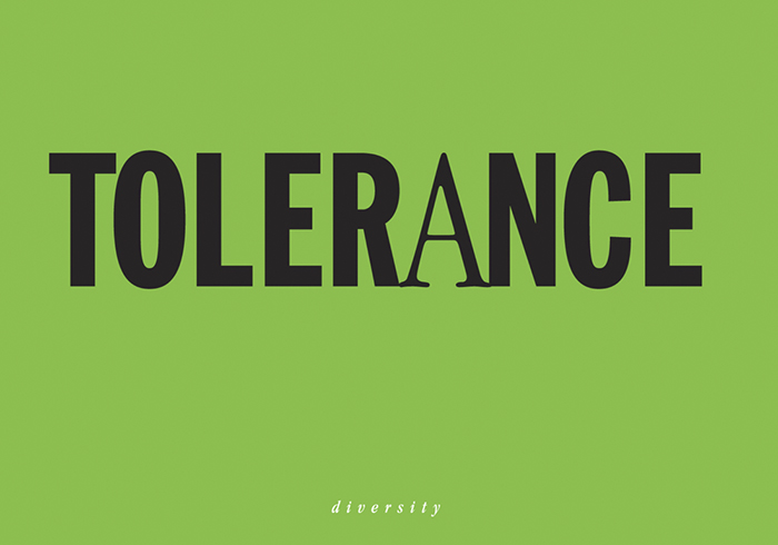
Cedomir Kostovic

Tolerance toward diversity.

More of his work can be found at: http://www.cedoposter.com/

Tuesday, November 17, 2015

Social Change Poster


This poster was designed by Lex Drewinski, titled Homo Sapiens. The quote that follows this poster is "Evil originates in the head." Which identifies with the image of a snake acting as a human brain.

Social Change: Campaign Tackles Sexual Violence on Campus


2014 maybe end up going down in history as the year that sexual violence rose to public awareness prominence in the society. In the Spring of 2015, an interdisciplinary team of students and faculty from Philadelphia University created a Public Awareness Campaign Against Sexual Violence on Campus. Students from graphic design communication and animation participated in the task. These designers wanted to raise awareness about sexual violence on college campuses and to educate students about the issue. The designer students create Brand Identity and Logo, taglines, Posters, Buttons, Stickers, a Mobile Website and Public Service Announcements.

Link: Click Here

Monday, November 16, 2015

Design For Good


Client: FDA
Project Title: What’s in your Protein?
Duration: Fall 2016
Team: Florida International University Graphic Design History Group 1 Class:
·       Professor: Silvia Pease
·       Students: Santiago Cevallos, Samantha Gonzalez, Kimberley Espinoza, and Yekaterina Lobuzova

Project Brief
There is an increasing concern of what ingredients and chemicals are put into meats or proteins. There needs to be a labeling system put in place in order to inform consumers on what is in their protein (meat or tofu). The World Health Organization released a report classifying processed meats as level 1 carcinogen and red meat as level 2 carcinogens. 

The group is going to build a system that is similar in appearance to a traffic light that will let you know if the protein products contain 0 chemicals (organic) or contain more than 10 unnatural ingredients. 0 chemicals will be represented with the color green. If the protein has a moderate amount of chemicals, then it will be represented with the color yellow. If the product has more than 10 unnatural ingredients, then it will be classified as red. This will be put on all packaging labels so consumers can quickly see if they want to purchase the product or not.

Budget

The group did not have a budget, but the general idea of the labels are already designed to sell the FDA the project so they can get a taste of the look and feel.

Research

Blippar.com – Augmented Reality advertising and marketing app.
Buycott.com
Chemical Maze

Films
·       Food, Inc.
·       King Corn
·       GMO OMG
·       Seeds of Death : Unveiling the lies of GMO’s

Books

·      Naveen Thayyil: Biotechnology Regulation and GMOs

·      B Nelson : Genetically Modified Organisms in Agriculture

·      BERNHARD A. KOCH : Damage Caused by Genetically Modified Organisms: Comparative Survey of Redress Options for Harm to Persons, Property or the Environment

·      Dayna Scott : Damage Caused by Genetically Modified Organisms: Comparative Survey of Redress Options for Harm to Persons, Property or the Environment


Articles:

Strategy

What’s in Your Protein will be implemented into the printing process of all protein-based products sold at any grocery store. It will be introduced to merchants first. A brief workshop will be held to help them become knowledgeable on the new protein labeling system and be prepared to answer any questions customers have on this new system.

Customers will become aware of the new labeling system on their products through smart advertising throughout the store. The labels will be legible through the use of the same recognizable color system of Red, Yellow and Green. When launching the new labeling system, What’s in Your Protein will have posters throughout the market explaining what each color means and how consuming this product will affect your body to help the customer become accustomed to this new labeling system.


Challenges

         The biggest challenge would arise when getting the approval from the Food and Drug Administration to include these symbols on all of the food labels. It would be inherent to provide the right amount of research and data to back up our claim that different kinds of protein needs to be labeled in order to inform the consumer about the chemicals within the product.

            The group needed to create a simple labeling system that would be eye-catching and straight to the point. Several designs had to be proposed before all agreed on the “traffic light” idea. Working as a group had its challenges as well and each member’s strengths needed to be utilized to come up with the concept.

            The label design had its own challenges. The group had to design a shape that would be simple to recognize for the consumer when it was placed on a certain protein product. The group decided that the shape of the label would represent that of a chemical symbol of a protein: the hexagon. Also, the shape needed to have a certain color that would describe the level of critical chemicals located inside the product. A series of three labels would be created with their respective red, yellow, and green colors. With the chosen colors the idea became clear that as a whole the label could be representative of a traffic light. Overall, the system needed to be clear and effective in order for the consumer to understand what type of protein they are purchasing and putting into their bodies.


Effectiveness

Though not yet actualized, this project is set to create awareness and work in tandem with many already used and trusted apps to further raise awareness of what people are consuming. Brightly colored labels in the familiar “traffic-light” sequence help create an association with already set in place ideals. For example: Should a consumer see a green hexagon on their chosen product the association process should cause that consumer to think “Green-good-god”. At the least, making their decision process faster, more informed and simpler.

After the labels become well known this system should be implemented by major apps such as Blippar and Buycott. Consumers will then be given the option of scanning these labels to receive details on what exactly is present in their food.

The labels will focus on protein-based foods and the chemicals present within them, hence the basic hexagonal shape (a rough translation of what a protein sequence appears to look like) to distinguish it from other labels and information on packaging. The connection to apps also allows for social media connections to further spread awareness. Students around campus should have no trouble identifying these labels and understanding the simple design formula as it is based off the traffic-light systems.

Those that have seen the virtual prototypes have stated that they would approve of this program to be put into effect across college campuses. This system could promote a healthier lifestyle especially for those that workout frequent on campus gyms and consume meals with high amounts of protein. 


Design for Social change


http://www.visualnews.com/2011/03/07/changing-the-world-one-poster-at-a-time/

http://www.jr-art.net/

The artist is called JR.

Social change designer


Cedomir Kostovic

"It doesn't matter which color - racism doesn't make any sense." This image visually illustrates the irrationality of racism.

More of his work can be found at: http://www.cedoposter.com/

Guerrilla Girls and Social Change Design


Guerrilla Girls are an anonymous group of feminist, female artists devoted to fighting sexism and racism within the art world. The group formed in New York City in 1985 with the mission of bringing gender and racial inequality in the fine arts into focus within the greater community. Members are known for the gorilla masks they wear to remain anonymous. They wanted the focus to be on the issues, not on our personalities or our own work. Also, their identity is hidden to protect themselves from the backlash of prominent individuals within the art community.

One Sunday morning they conducted a count at the MET Museum in New York comparing the number of nude males to nude females in the artworks, and the number of male artists to female artists on display. In 2004, they counted again and only 3% of the artists in the Modern and Contemporary sections were women, and 83% of the nudes were female. 

Website to other work:  http://www.guerrillagirls.com/posters/index.shtml

Tuesday, November 3, 2015

1. Post modernism in graphic design is used loosely as a term to describe the climate of cultural change. It is difficult to describee because it is a concept that appears in a wide variety in areas of study, including art, architecture, music, film, literature, sociology, communication, fashion, and technology. It is also not clear when post modernism began, making it hard to locate historically,

2. Designers felt the need to reject some or all of International style because post modernists reject the modernist concept of the "master theory", a single concept or style (in this case, International style), that defines a field. Post modernists' stylistic conventions are plural and unstable, which goes against the dogmatic rules of International style.

Sunday, November 1, 2015

Discuss the aesthetics and conceptual connections between post-modern architecture and graphic design?

Discuss the aesthetics and conceptual connections between post-modern architecture and
graphic design?


Post-Modernism reflected a “climate of cultural change.” This meant things were more inclusive and there was a larger demographic and pool from which designers and designs could be taken. Post-modernism saw many new design styles come forth and changed the world in a way that is is still being seen. Architects during this time, post 1960, broke with what was called “The International Style.” The graphic artists of the Post-Modern era, artists like Tibor Kalman, Tadanori Yokoo, and David Carson use methods which embody themes of “pluralism” and expressionistic styles, which move away from the previous modern and international styles. An example of this is architecture is the Pruitt-Igoe Public Housing done by the architect Minoru Yamasaki. He tried to create a modernist utopia to help bring impoverished people into a new setting which would change their lifestyle and establish them in Modernism. After this failed it was also a significant failure for Modernism which brought on the ideas of Post-Modernism as a fix for the problems of Modernism. Post-Modernist architecture hoped to differ from Modernism architecture in growing away from “blandness” and “inhumanity.” Post-Modern architecture hoped to employ many elements of styles, colors, forms and materials available.


An example of Post-Modern architecture is the architect Michael Graves. His Steigenberger Hotel in El Gouna, Egypt is an example of this new style. Which did away with the harsh lines, bland colors, and severity of Modernist Architecture (as seen below in Le Corbusier’s building.)


These methods and styles used in Post-Modern architecture come from the same place that influenced Graphic Designers. They had to reconsider what visual themes they were using to define the world around them, more color, less rigidity, a restructuring of the grid, and implementations of global themes and aesthetics.

Monday, October 26, 2015

Conceptual Design of Postmodern Era

Tibor Kalman 

Discuss the strengths and weaknesses of conceptual design as practiced by Tibor Kalman and others. 

Kalman was criticized for using sensitive issues such as homelessness as a public relations ploy to garner attention, but at the same time he was the master of peaking public interest in just this way. He and Sagmeister yearned for design that means something and connects to people at a human level. Kalman focused on multiculturalism and global awareness through the use of bold graphic design, typography, and juxtaposition of photographs and doctored images. He liked to depict racial minorities where he changed the way the world was viewed. He called himself a social activist. Kalman was sincere with his concepts and he understood that being a master of good design meant nothing unless it supported a message that led to action. However, Kalman was intolerant of mindless consistency and was not reluctant to make people angry about their concepts. He would be remembered more for his critiques on the nature of consumption and production than for his formal studio achievements. 


Other Artists: Stefan Sagmeister, John Maeda, Stephen Sorrell


Stefan Sagmeister


Is postmodernism a politically engaged trend. Explain?

Is postmodernism a politically engaged trend. Explain?

Yes there is. A comment from Steven Best and Douglas Kellner states that “As with postmodern theory, there I no one ‘postmodern politics,’ but rather a conflicting set of propositions that emerges from the ambiguities of social change and multiple postmodern theoretical perspectives.” Postemodern politics takes a variety of forms. On one end of the spectru is the “anti-poltics’ of Baudrilard, a: cynical, despairing rejection of the belief that politics can be used to change society. On the other side of Baudrillard’s negative, nihilistic approach is a more affirmative one, outlined by Faucault, Lyotard , and Roty, who suggest that the way to “enhance individual freedom” and bring about “progressive change” is to concentrate on the local level.

                Although there is a lack of consensus surrounding much of Postmodern politics, most agree Postmodernists fall on the left side of the political spectrum. Barbara Epstien , writes, “Many people, inside and outside the world of Postmodernism have come to equate Postmodernism with the left.

       
         Most early French Postmodernists emerged from the Marxist tradition. For Postmodernists, the politics is not centered around political parties, utopian visions, or an Ultimate telos; rather, it is a tool of experimentation that involves a radical critique of the existing systems of power in a society, the identification of oppressed groups, and remedy for bringing those identified groups out of oppression to achieve a sense of social justice

Group: Alejandro Perez, Evan Gallagher, Natalie Helver, Ashley Pierre-Maintus

Monday, October 19, 2015

Thoughts on American Democracy - The Wolfsonian 2008 Ellen Lupton

Ellen Lupton uses an individual design style to express her views on democracy in America. She is an American designer, born in Maryland and educated at Cooper Union she specialized in typography. She aimed to bring design to the “masses” at a time, during the 1980s and 1990s when design was considered “esoteric” and “only for very organized people.” One of her books is D.I.Y. – Design It Yourself. She is very interested in challenging the standards of graphic design and is part of the Post-Modern school of Design. She is currently the curator if design for Cooper-Hewitt, a well known design firm and is still active in the design world. In the poster seen here she uses the images of birds, almost in a collage fashion, on a grid style format. She uses handwritten style typography that is placed in complement to the images on the space. She uses whitespace to create a sense of separation between the images and pictures while making a political commentary. She cites various statistics of so called “American Democracy.” One of the statistics is about the incarceration rate of Americans. Next to this text is a bird in a cage, a hand drawn scraggly cage over a collaged bird. It’s this style of manipulation that creates a visually striking poster that is whimsical and delightful to look at, but deals with a very serious subject.

Chapter 6 Bauhaus and The New Typography

1. Cite some parallels that link Dada and Constructivism in Germany.  2. Is an expressionist idiom somehow more appropriate as a vehicle for dark feelings than for other sentiments? Why or why not?  3. Why was architecture so central to the Bauhaus in both a practical and theoretical sense?  1. Dada and Constructivism were linked through the ideology of social change through art. Both groups though different in their aesthetics rejected classical aesthetics means to achieve a desired outcome. Germany came to harbor much of Russian Constructivist ideals and actual artists themselves. The main connection between the two was a lean towards the left: Communism. As well both groups were interested in a new technique which was to dominate the graphic design of the two schools of thought, photomontage. Photomontage is a process through which separate unrelated photos are collaged together to create a new image that is an amalgamation of other images. This appeals to the sensibilities of the two groups which sought to “engage with society.” They needed to convey the real world around them and the current state of affairs: cultural and political. Yet they both wanted a new, abstract, nuanced way to represent the things around them. A simpler, and mostly more geometric and absurd way.
Hannah Höch, Cut with the Kitchen Knife through the Beer-Belly of the Weimar Republic, 1919
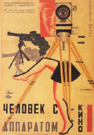
The Man with the Movie Camera, 1929, Vladimir and Georgii Stenberg 2. I personally believe the expressionist idiom did a lot to convey the zeitgeist of post-war Germany. Though the criticism may seem true that it was “too romantic” or “overly subjective,” it does elicit ethos which geometry does not. If we compare the two images seen below there is a huge emotional impact in Kate Kollwitz’s work. The human figures have exaggerated dramatic expressions. The elongate figures are highly organic and expressive and there is a literal scene of death and loss. The monochromatic colors add to the melancholic atmosphere and sense of loss. In Grosz’s poster there is little to relate to. While it does a good job conveying information it is pragmatic in a sense and de-humanized. There is no way of knowing “dark feelings” because there are no expressions, nothing to sympathize with. This is why expressionism reigns supreme in the department of emotion and arguably in the idiom of expression of the German people and psyche, post-war.
Kate Kollwitz, Die Liebenden dem Toten (gedenkblatt für Karl Liebknecht) [The living and the dead [memorial for Karl Liebknecht], 1921
George Grosz - DADA-Bild 3. Architecture was incredibly central to the Bauhaus movement because it embodied their ideals. The cornerstone of Gropius’ intention in creating the movement was to combine the fine and applied arts. He felt that the only way to accurately combine “arts” and “crafts” was to synthesize them into an architecture. This idea of architecture too would help to propagate the ideas of a New Republic and a modern society. And in this modern society the places where progress would happen and society would be changed would be inside of these designed buildings: through architecture. Architecture under Gropius in the Bauhaus style soon moved to synthesize expressionism into its fabrication. This theoretical approach to a new society moved to include ideas from the Medieval era, a time before the suffer of the war and the disintegration of society.
Szépvölgyi road 88, 1933. Fischer József.a

Monday, October 12, 2015

Group 3 Bauhaus questions

4. How did gender play itself out at the Bauhaus? Was the later machine aesthetic in some way demonstrably “masculine”? 
·         When the Bauhaus in 1919 opened the constitution had stipulated an end to gender discrimination in many aspects of German life including an education , so women were no longer to be excluded from publicly funded institutions
·         In practice though Gorpous had separated women into more “female” roles, such as, pottery, book binding, weaving.
-Which was added because they wanted to break this age old discrimination
·         The Machine aesthetic could be considered to be masculine because it embraced the machine culture which usually would be things such as carpentry, architecture, engineering things, more reliable to machines, rather than what women would do which were pottery, weaving, etc.

5.  How did different Bauhaus professors approach the political issues inherent in design work in Germany during the 1920s and early 1930s? Was the Bauhaus at its core an essentially conservative or liberal institution? 
·         The professors at the Bauhaus approached political issues in design work in Germany around the 1920s and early 1930s was that in the case of Paul Renner he designed this booklet called “kulturbolschewismu” which criticized the Nazi’s cultural policy.
·         The new Bauhaus in Weimar was funded by the state government of Thuringia, with support from the majority party, the liberal Social Democrats. But after only a few years the political winds were blowing in a more right-wing, nationalistic direction. The Bauhaus and its faculty came under conservative criticism and soon the school lost its funding. In March 1925 the Bauhaus closed its doors in Weimar and moved to Dessau.
After the Bauhaus left Weimar, some teachers and staff less antagonistic to the conservative political regime remained there and established a school of industrial design. Later known as the Technical University of Architecture and Civil Engineering, it would become the Bauhaus University Weimar in 1996.
·         Due to Bauhaus losing funding from a once liberal government in Thuringa, Germany, a majority of the faculty up and left which closed Bauhaus in Weimer then reopened in Dessau, demonstrates that Bauhaus political ideology corresponded with their belief in Liberalism or the idea of “free thinking”
·          6. If the “essence of the new typography is clarity” then why did its practitioners embrace sans serif type?

In the Die new Typographie, it states that “the essence of the new typography is clarity. This puts it into the direct opposite to the old typography, whose aim was “beauty” and whose clarity did not attain the high level were require today” however, when Tschichold’s conception of the sans-serif typography that found the simple font not only acceptable, but also felt that the modern photography could only be complemented by san serif block.

Group members:
Alejandro Perez
Evan Gallagher
Ashley Pierre-Maintus
Natalie Helver

Bauhaus

1.     Cite some parallels that link Dada and Constructivism in Germany. 
There are several parallels between the Dada and Russian Constructivist thinking in Germany. Both movements embraced the idea of utopian Communism. They believed that geometric abstraction referenced the real world that conveys strong verbal ideas. The groups created photomontages and assemblages using industrial iconography to create posters that were used for social activism. Dadaists and Constructivists criticized Expressionists because of the emotion in their work. Both members rejected taking on the role of the fine artists because they wanted to create a movement that was different aesthetically.

2.     Is an expressionist idiom somehow more appropriate as a vehicle for dark feelings than for other sentiments? Why or why not?
Expressionist idiom is appropriate for feelings in general because in expressionism artists depict non-objective reality. Rather, they depict the subjective emotions and responses, which are aroused from emotions inflicted by objects, events and the world around them. It is a form to express emotional experience rather than impressions of the external world.

3.     Why was architecture so central to the Bauhaus in both a practical and theoretical sense? 

Architecture was practical to the Bauhaus because Bauhaus was the “Construction house”. Walter Gropius was the founder of Bauhaus and he was an architect that rejected the bourgeois. The architectural aesthetic was to be simple, avoid decorative details and wanted to use classical forms. The architecture was a pure form and was functional without ornamentation. It was practical to have flat roofs, smooth surfaces and façades with minimalistic and neutral aesthetics.